Our accessibility features – background and display options
At Kortext, we’re continually working to make our products accessible and inclusive to meet the needs of all students and remove barriers to learning. In fact, we’ve been doing this for years.
In the first of our accessibility blog series, we explored the font style and text size options in Kortext study. Now we’re going to find out more about the background and display features.
File types
As a reminder, the accessibility features available in our content are dependent on the file type supplied by publishers. It’s easy to find out whether a book is an EPUB or a PDF in Kortext study.
If using a browser, click on the three dots below a book’s author and title details, then select ‘Book information’. The file type is given under ‘Format’.
If using the Kortext app, tap on the three dots in the right-hand corner next to a book’s author and title details, then select ‘Book information’ where you’ll see the file type given under ‘Format’.
Background options
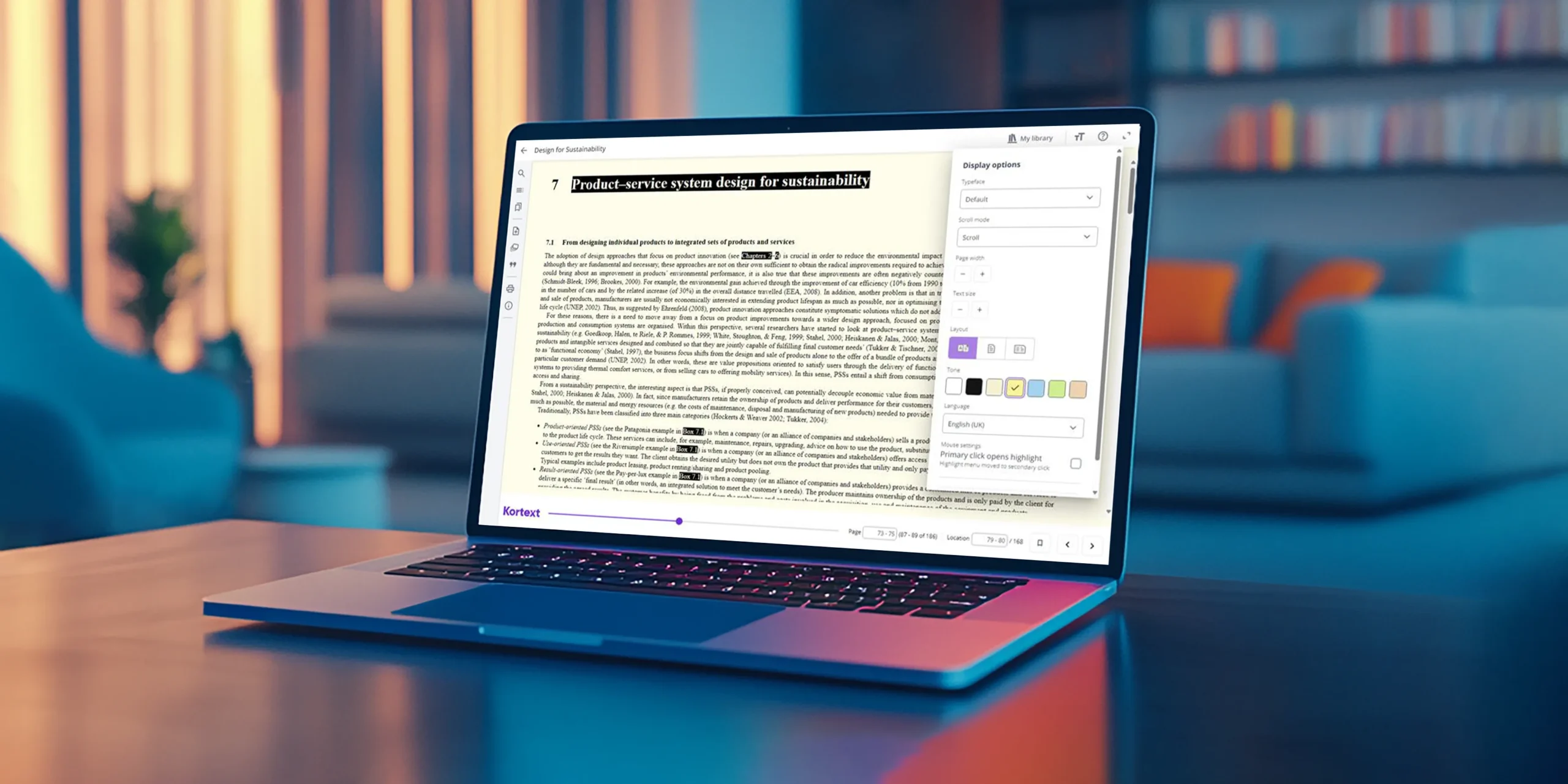
In an EPUB, you can choose from a selection of coloured backgrounds (sepia, yellow, blue, green and peach) when using a browser.
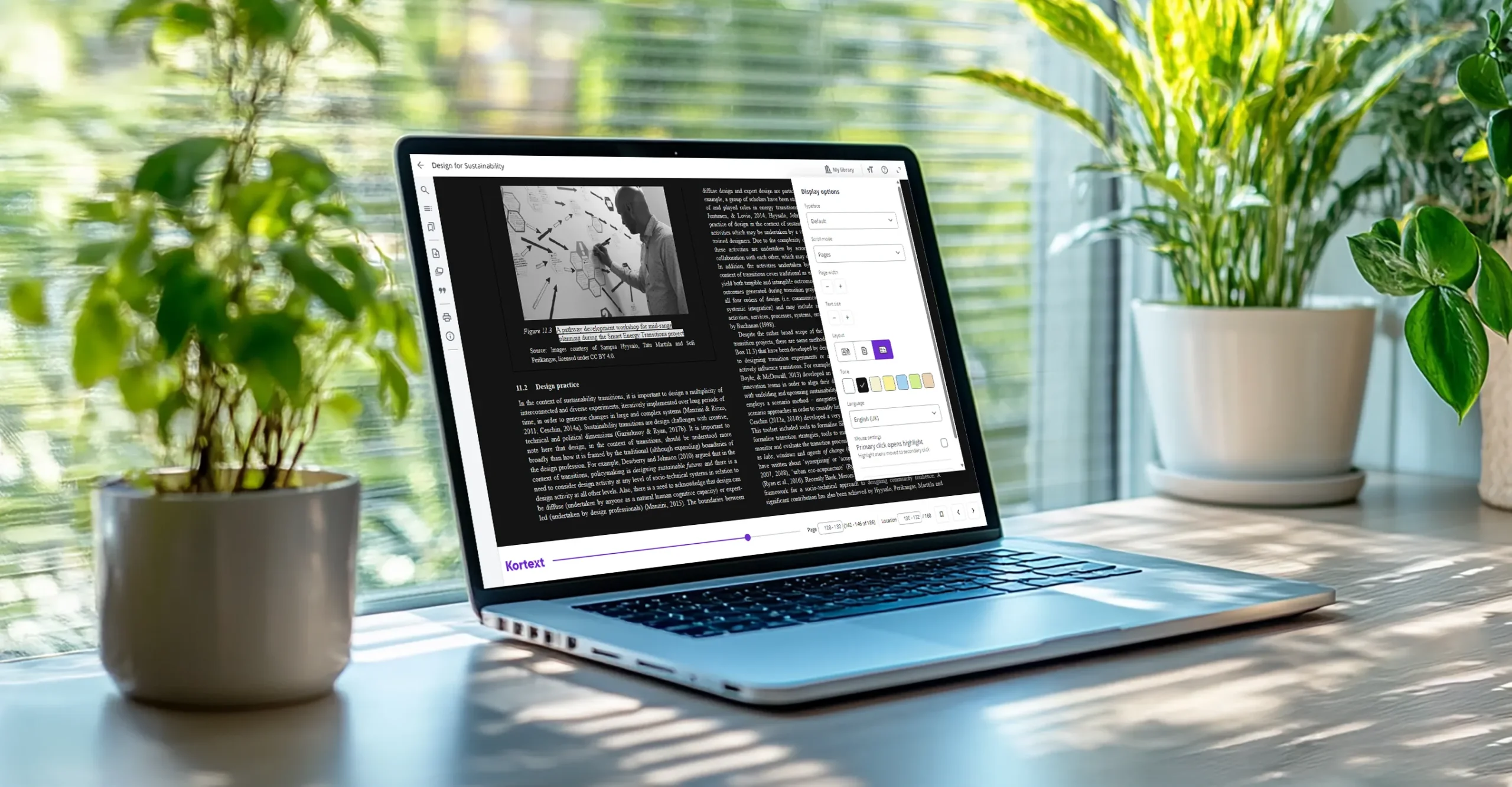
You can also switch from the default mode (black text on a white background) to dark mode (white text on a black background).
To change the background or mode in a browser, click on the ‘TT’ icon (‘Display options’) in the top right-hand corner of an EPUB. In ‘Tone’, you’ll find a series of coloured squares – click on the colour of your choice to change the background or mode.
In the Kortext app, you can change the background or mode in both EPUBs and PDFs. Within an eBook, tap on the ‘AA’ icon in the top right-hand corner, then select a background or mode by tapping on a coloured square.

Visual stress
Having sufficient contrast between text and background helps people with low contrast sensitivity and those with colour blindness. In addition, it improves visibility for everyone in different lighting conditions, for example by reducing glare in bright sunlight.
Meanwhile, coloured backgrounds are thought to reduce visual stress, which helps people with dyslexia and other conditions like Irlen Syndrome.
A coloured background can make words easier to distinguish, eliminate visual distortions and enhance visual processing, providing a more comfortable reading experience.
However, different colours benefit different people. That’s why it’s important to provide a choice of backgrounds so a user can select the one that’s best suited to their needs. Often pale shades of yellow, blue or green are the most effective – all of which are included in Kortext study.
Display options
As well as background options, you can adjust the display options in EPUBs and PDFs.
In an EPUB, click on the ‘TT’ icon as before when using a browser. Next, go to the ‘Scroll mode’ drop-down menu and select ‘Pages’. Choose from auto, single or double page view in ‘Layout’ and adjust the page width as needed by clicking on – or + in ‘Page width’.
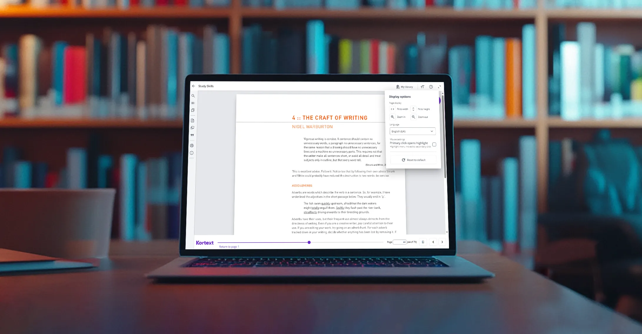
To change the page view in a PDF, click on the ‘TT’ icon. In ‘Page display’, select from ‘Fit to width’ or ‘Fit to height’ and ‘Zoom in’ or ‘Zoom out’ when using a browser.
In the Kortext app, tap on the ‘AA’ icon in the top right-hand corner of an open PDF and select ‘Fit to width’. Pan and zoom are also available on touch screen devices for both EPUBs and PDFs.

Magnification and reflow
Kortext study supports magnification and reflow across all content: PDFs use magnification tools (zoom in or out and fit to width or height, as above), while EPUBs use reflow.
In an EPUB, when a user changes the font style or increases the font size, the text reflows in the eReader screen. That means the text is automatically adjusted to fit the screen, ensuring it remains in a single column without the need for horizontal scrolling.
While helpful for all users, enlarging and reflowing text is essential for people with low vision. Enlarging text improves character recognition, while reflowing aids line tracking, reduces scrolling effort and ensures content remains fully visible on-screen.
Accessibility support
If you experience any problems or have any queries about accessibility, please email us at accessibility@kortext.com or call us on 01202 551203 for assistance.
There are many other accessibility features on the Kortext platform. You can find out more on our dedicated accessibility page.


